Tutorial: Comparative Analysis - Glycerol vs Cholesterol
To illustrate how TRANSIT works, we are going to go through a tutorial where we analyze datasets of H37Rv M. tuberculosis grown on glycerol and cholesterol.
Run TRANSIT
Navigate to the directory containing the TRANSIT files, and run TRANSIT:
python PATH/src/transit.py
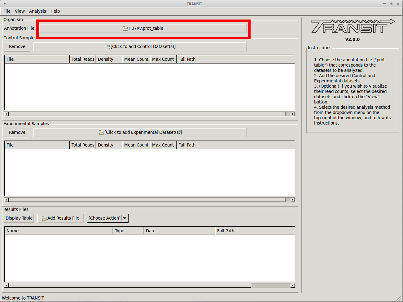
Adding the annotation file
Before we can analyze datasets, we need to add an annotation file for the organism corresponding to the desired datasets. Click on the file dialog button, on the top of the TRANSIT window (see image below), and browse and select the appropriate annotation file. Note: Annotation files must be in “.prot_table” format, described above.
Adding the control datasets
We want to analyze datasets grown in glycerol to those grown in cholesterol. We are choosing the datasets grown in glycerol as the “Control” datasets. To add these, we click on the control sample file dialog (see image below), and select the desired datasets (one by one). In this example, we have two replicates:
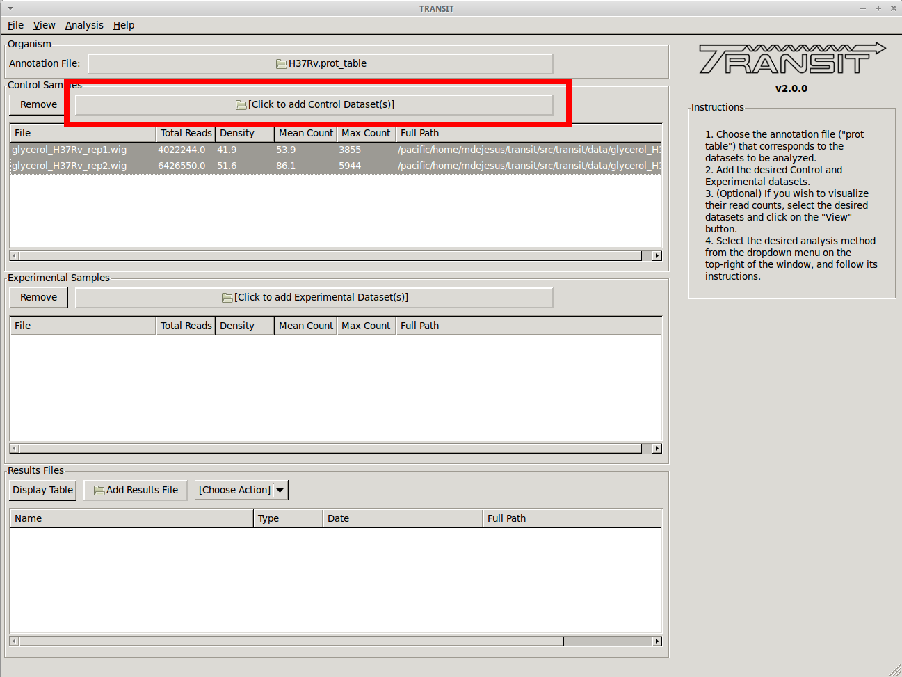
As we add the datasets they will appear in the table in the Control samples section. This table will provide the following statistics about the datasets that have been loaded so far: Total Number of Reads, Density, Mean Read Count and Maximum Count. These statistics can be used as general diagnostics of the datasets.
Visualizing read counts
TRANSIT allows us to visualize the read-counts of the datasets we have already loaded. To do this, we must select the desired datasets (“Control+Click”) and then click on “View -> Track View” in the menu bar at the top of the TRANSIT window. Only those selected datasets will be displayed:
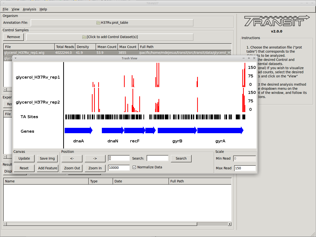
This will open a window that allows that shows a visual representation of the read counts at the TA sites throughout the genome. The scale of the read counts can be set by changing the value of the “Max Read” textbox on the right. We can browse around the genome by clicking on the left and right arrowm, or search for a specific gene with the search text box.
This window also allows us to save a .png image of the canvas for future reference if desired (i.e. Save Img button).
Scatter plot
We can also view a scatter plot of read counts of two selected datasets. To achieve this we select two datasets (using “Control + Clicck”) and then clicking on “View -> Scatter Plot” in the menu bar at the top of the TRANSIT window.
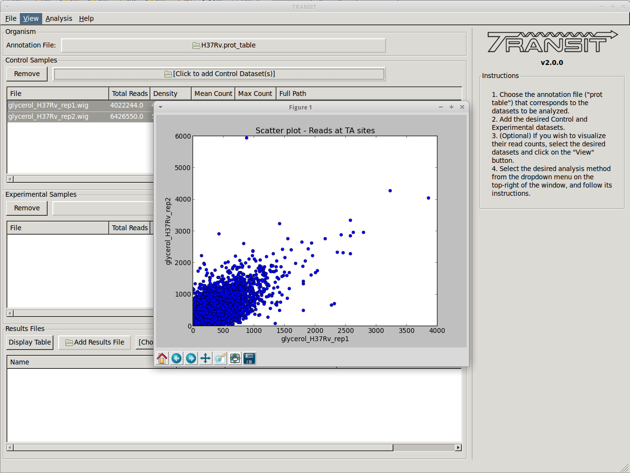
A new window will pop-up, show a scatter plot of both of the selected datasets. This window contains controls to zoom in and out (magnifying glass), allowing us to focus in on a specific area. This is particularly useful when large outliers may throw off the scale of the scatter plot.
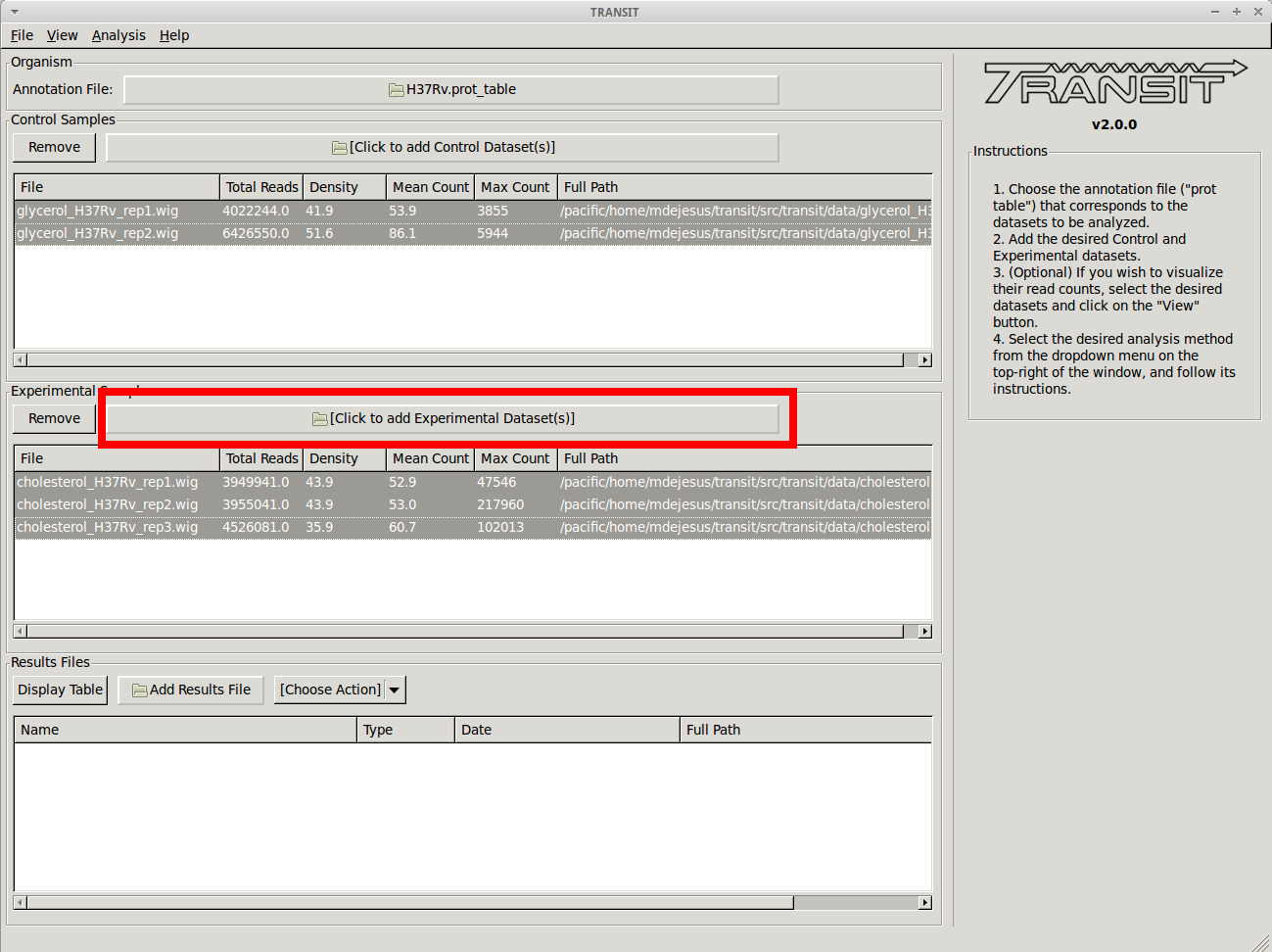
Adding the experimental datasets
We now repeat the process we did for control samples, for the experimental datasets that were grown on cholesterol. To add these, we click on the experimental sample file dialog (see image below), and select the desired datasets (one by one). In this example, we have three replicates:
Comparative analysis using Re-sampling
To compare the growth conditions and assess conditional essentiality, we select “Resampling” from the list of methods in the drop-down menu on the right side of the TRANSIT window:
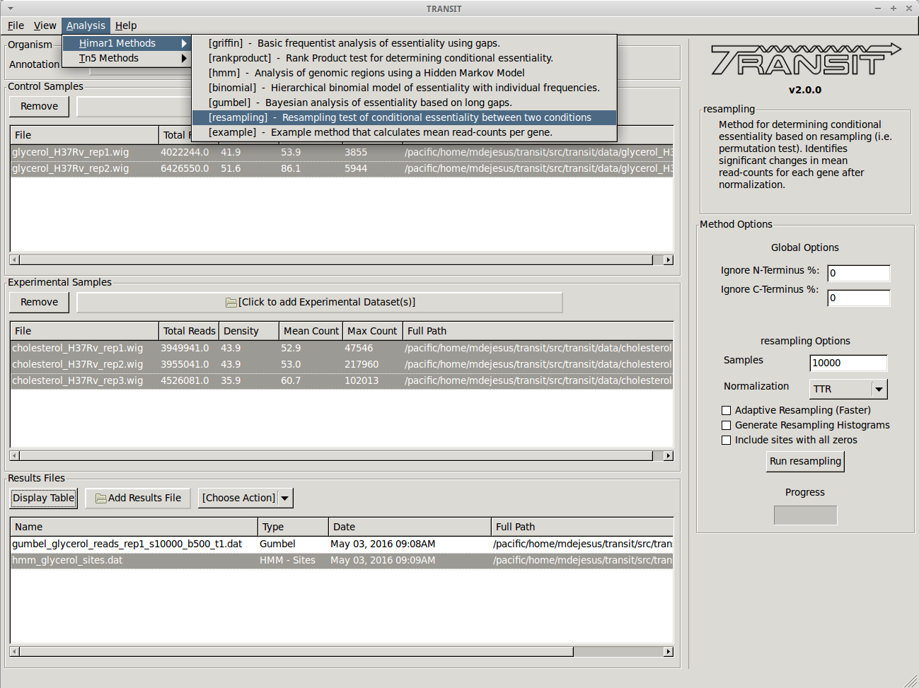
This will populate the right side with options specific to the Resampling method. In this case, we choose to proceed with the default settings. However, we could have set a different number of samples for the resampling method or chosen the “Adaptive Resampling” option if we were interested in quicker results. See the description of the method above for more information.
We click on the “Run Resampling” button to start the analysis. This will take several minutes to finish. The progress bar will give us an idea of how much time is left.
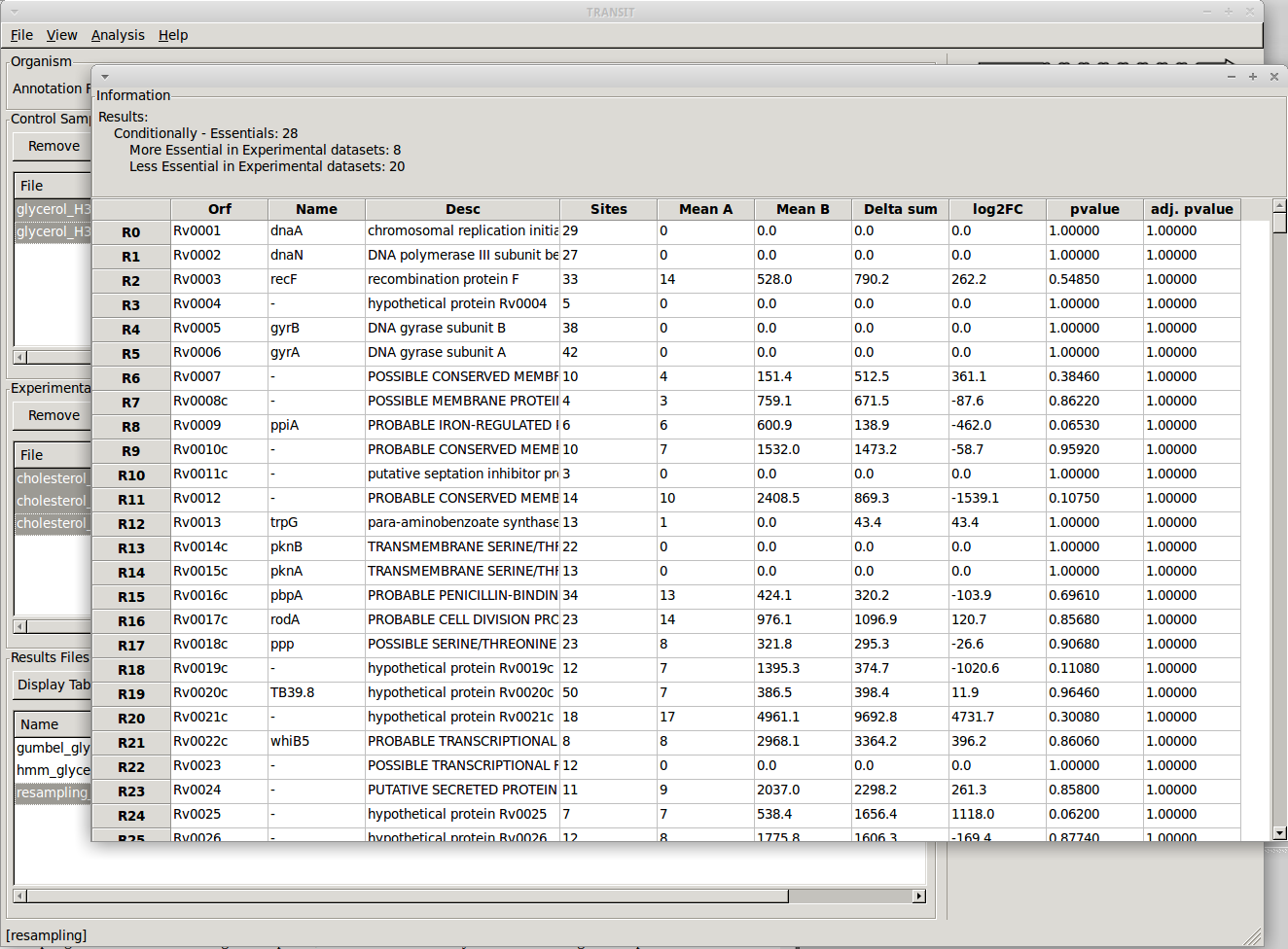
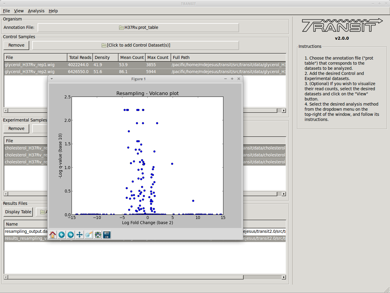
Viewing resampling results
Once TRANSIT finishes running, the results file will automatically be added to the Results Files section at the bottom of the window/
This window allows us to track the results files that have been created in this session. From here, we can display a volcano plot of the resampling results by selecting the file from the list and selecting the volcano option on the dropdown menu. This will open a new window containing the figure:
To view the actual results, we can open the file in a new window by selecting it from the list and clicking on the “Display Table” button.
The newly opened window will display a table of the results. We can sort the results by clicking on the column header. For example, to focus on the genes that are most likely to be conditionally essential between glycerol and cholesterol, we can click on the column header labeled “q-value”, which represents p-values that have been adjusted for multiple comparisons. Sorting q-values in ascending order, we can see those genes which are most likely to be conditionally essential on the top. A typical threshold for significance is < 0.05. We can use “Delta Sum” column to see which conditions had the most read counts in a particular gene. The sign of this value (+/-) lets us know on which condition the gene is essential and which condition it is non-essential. The magnitude lets us know how large the difference is. For example, glycerol kinase (GlpK) is necessary for growth on glycerol but it is not expected to be necessary when grown on another carbon source like cholesterol. We confirm our expectations by noticing that the sum of read counts in glycerol is only 22 reads (normalized), while there are a total of 2119 reads in cholesterol. The difference (2096) is positive, which means it is necessary for growth in glycerol but not cholesterol. Because we ran the resampling method with the “Histograms” options, we also have the ability to view the histograms of permutation differences for each of the genes by selecting a gene and right clicking:
From this menu we can display the histogram, or view the read-counts for that specific gene in Track View: